
Derby & Derbyshire ICB · LSOA-level intelligence
See population health need, street by street.
An interactive mapping tool that turns hundreds of health, deprivation and demographic indicators into a single picture of your population — down to neighbourhoods of around 1,500 people — with the services that serve them overlaid and AI-written briefings on what it all means.
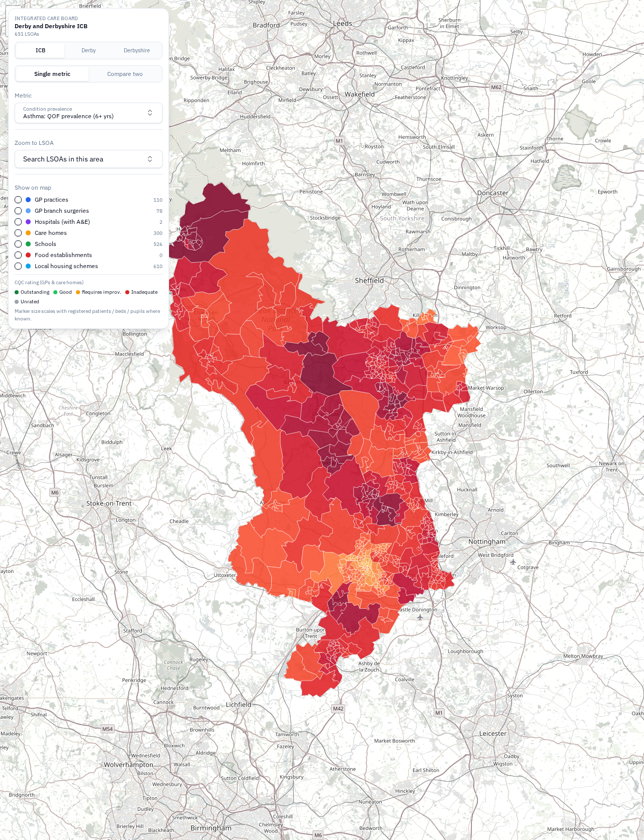
Live tool · Asthma prevalence · Derby & Derbyshire ICB
01
What the tool does
Every layer is interactive. Pick an indicator, overlay a second one, switch on providers, then ask for a written briefing — the map and the narrative always describe the same underlying data.
300+ indicators, one map
Condition prevalence, deprivation, demographics, housing, crime, prescribing and more — every indicator rendered as an LSOA-level choropleth with a nationally anchored scale, so colours mean the same thing everywhere.
Compare two metrics at once
Switch to comparison mode and the map becomes a 5×5 bivariate grid — obesity against deprivation, asthma against air quality — so correlation between need and its drivers is visible at a glance.
Providers in context
GP practices, hospitals, care homes and schools overlaid on the same map, RAG-rated by CQC or Ofsted grade and sized by the population they serve.
AI area intelligence
One click generates a written briefing on what the map shows — hotspots, inequality patterns, ethnicity and deprivation context — grounded strictly in the underlying data, with stated limitations.
Three geography levels
View the whole ICB footprint, or drill into Derby city or Derbyshire county. Every view zooms automatically and re-scales the analysis to the area you choose.
Built for decisions
Designed for commissioning, neighbourhood planning and health inequality work — the evidence layer underneath business cases, JSNAs and place-based plans.
02
What you can use it for
Targeting health inequalities
Identify the neighbourhoods where burden of disease and deprivation coincide, with the evidence quantified and ready to cite in a JSNA or inequality plan.
Commissioning and service planning
See where need is highest relative to where services actually are — GP practices, care homes and hospitals shown against the populations they serve.
Neighbourhood and place working
Give place teams a shared, street-level picture of their patch: prevalence, demographics, housing and the local provider landscape in one view.
Briefings and reports
Generate a written, data-grounded description of any view — hotspots, inequality patterns and context — as the starting point for board papers and stakeholder briefings.
Explore the live map
Currently scoped to Derby & Derbyshire ICB, Derby city and Derbyshire county.